Illuminated in two iconic styles


Illuminated in two iconic styles
[Summa theologica pars III | Tertia pars Summae]
by Antoninus Florentinus (Saint Antoninus, Archbishop of Florence)
Venice: Leonardus Wild, 1480
Part 3 of 4 (2 vols) | v. 1: [220] of [222] leaves (lacking A4 text and A1 blank) -- v. 2: [209] of [210] leaves (lacking a1 blank) | Folio | v. 1: A^10(-A1 blank,A4) B-N^10 O^8 P-Q^10 R^8 S^10 T^8 V-Y^10 Z^8 -- v. 2: a^10(-a1 blank) b-f^8 g^10 h-l^8 m-y^10 z^8 | 315 x 210 mm
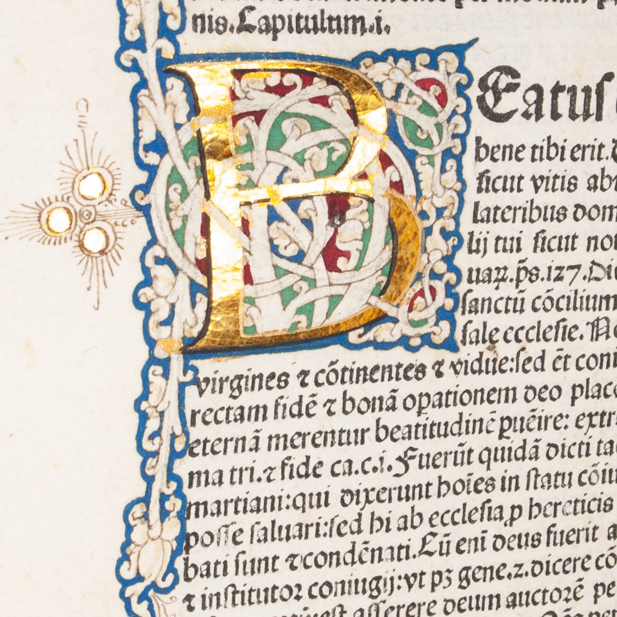
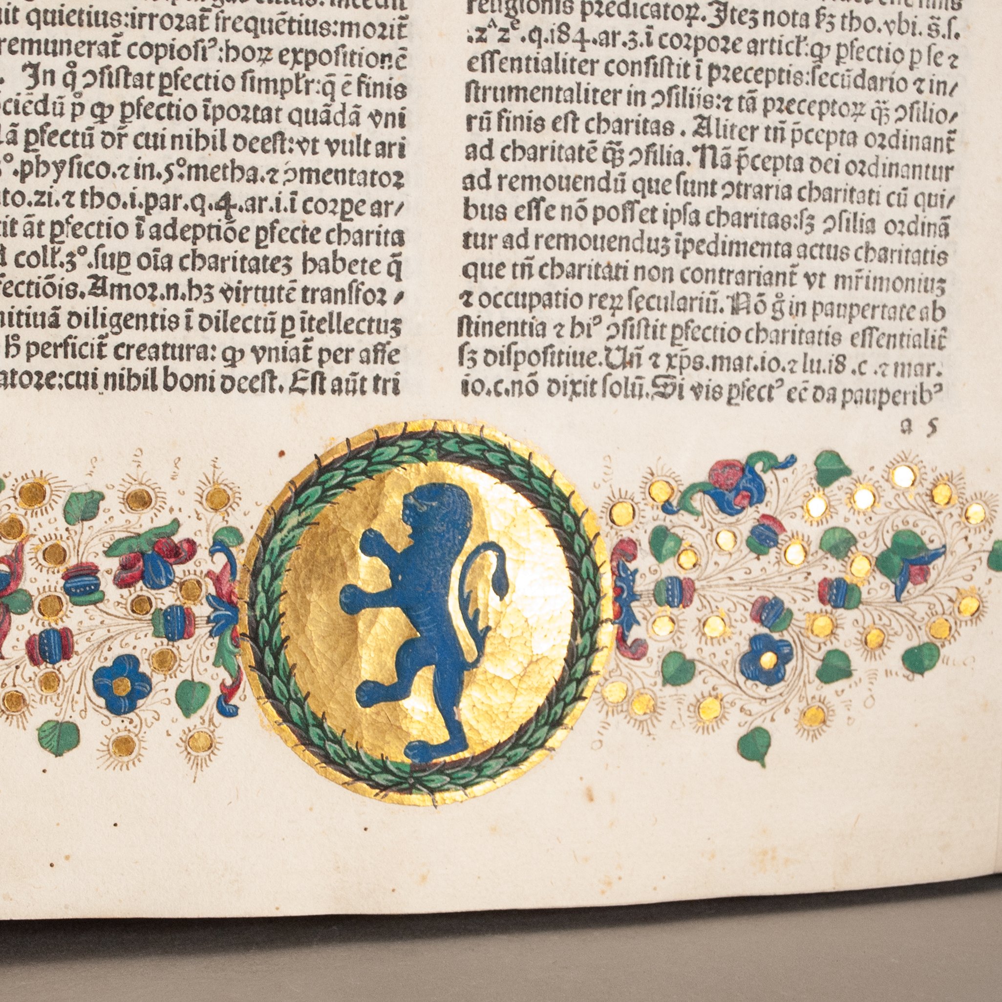
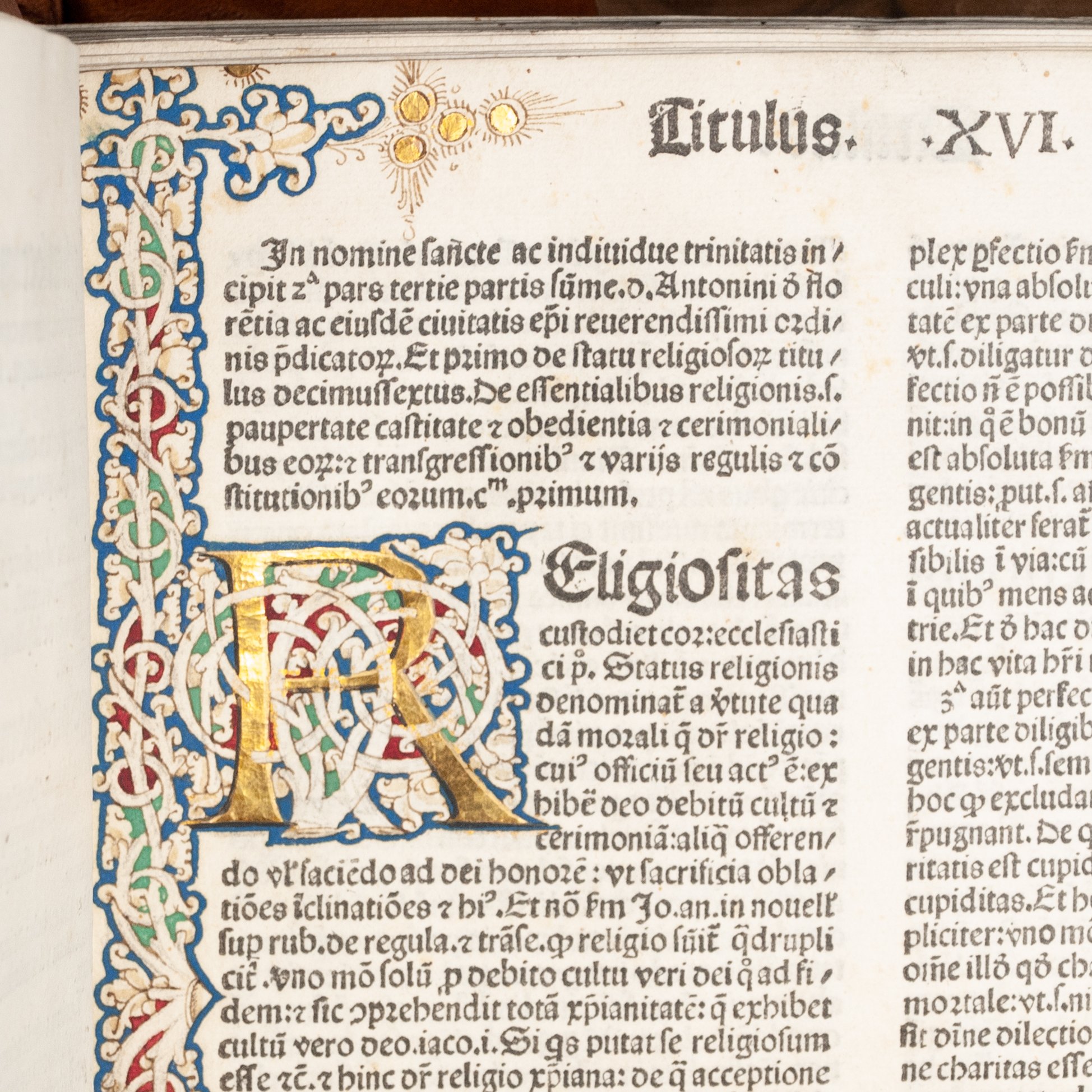
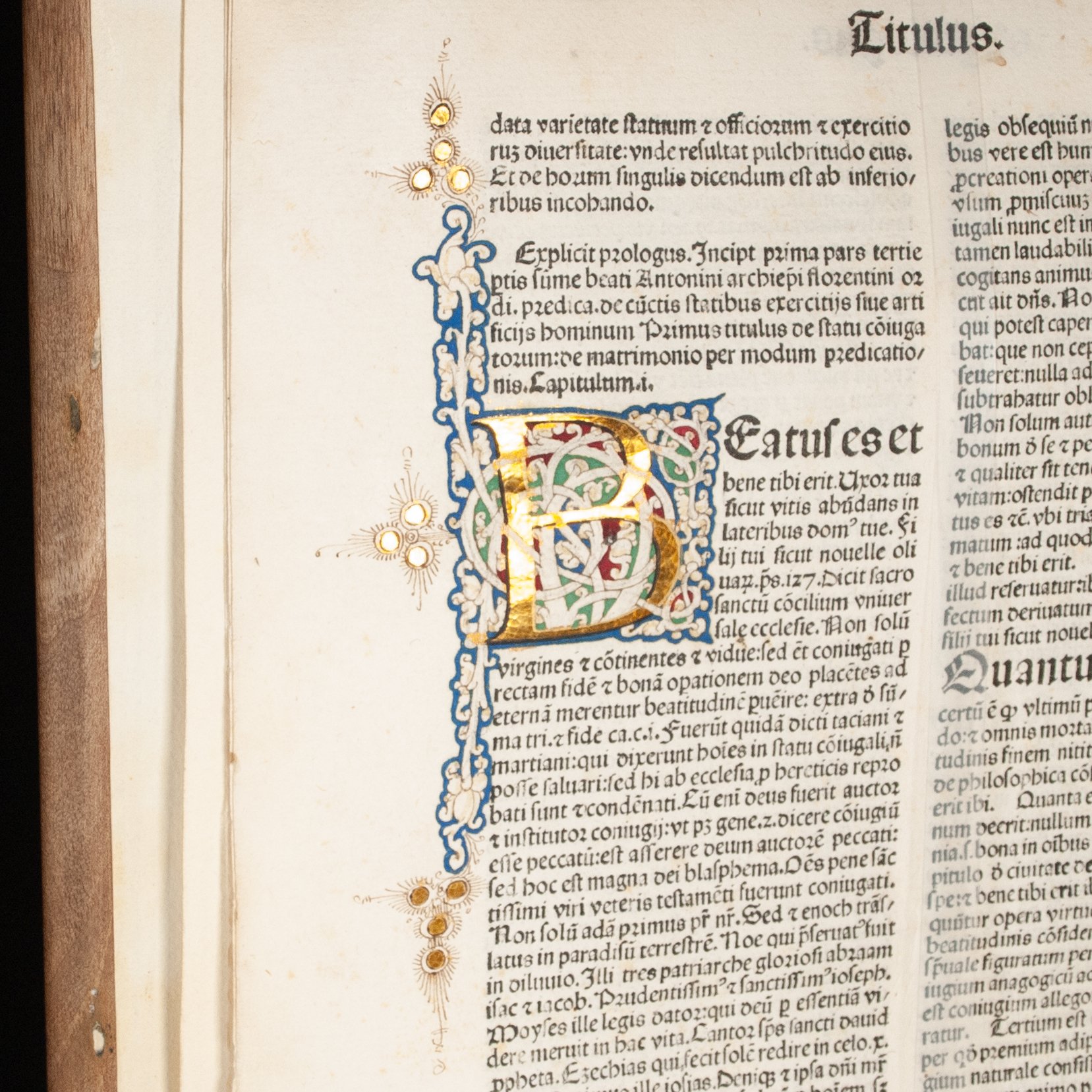
The third part from the third edition of the Florentine archbishop's complete Summa theologica (aka Summa moralis), his most ambitious work, and "the most important summary of late Medieval Catholic theology" (Dondi and Harris). Part II appeared first, with editions in 1474 and 1477. Our edition was preceded by Anton Koberger's complete Summa of 1477-1479 and Nicolas Jenson's of 1477-1480. In this edition, our Part III was printed before the other parts, and each part likely would have been available for purchase separately. The summa was the pinnacle of a medieval writer's career, a comprehensive treatise that aimed to summarize or synthesize the entirety of a field—moral theology, in this case, and intended to aid priests with their many pastoral duties. Thomas Aquinas remains perhaps the best known contributor to the scholastic summa genre, and one upon which Antoninus modeled his own effort. ¶ The genre's staid name can give the impression that little of worldly interest might be found between the covers, but we hope you'll give moral theology a chance. After all, it's fundamentally the study of conducting yourself ethically in the real world. Antoninus's Summa is packed with earthly affairs, something particularly true of our two volumes. "The third part, the best known and studied, concerns the problems found in contemporary society. The most innovative message of this part consists, in fact, in having reconciled the Christian vision of religious vocation with the humanistic and secular vocation facing the world of letters, of the liberal professions and above all the trades" (Bazzichi). Just scratching the surface, these volumes speak of lawyers and their appropriate salaries (H4r); medicine, including abortion (H9v); and business and trade, where the section on barbers speaks of bloodletting (I9r). On the topic of trade, Antoninus has even been called a "great economist of the Middle Ages" for his theories on value and commerce (Robbins). "As Florence was one of the commercial and financial centers of the time, it is not surprising that he deals with several economic aspects" (Schlag). Much of this economic thought drew on earlier sources, but he did contribute fresh ethical considerations to the field. ¶ Illuminated in not just one, but two iconic Italian styles. In the lower margin of a5r we find floral and gold dot decoration, interspersed with delicate penwork and flanking a wreathed coat of arms on a brilliant burnished gold ground. This style of illumation can be traced to a group of Ferrarese manuscripts from the middle of the century, the magnificent Bible of Borso d'Este perhaps the most opulent of them all. The accomplished miniaturist Leonardo Bellini popularized the style in Venice by the early 1460s, where it remained in vogue until the fashion for illuminating incunables waned generally in the 1480s. ¶ On the same page, running the length the text in the inner margin and incorporating a large initial R in burnished gold leaf, is the distinctive white vine style (bianchi girali), perhaps the most emblematic style of Italian illumination. Red and green run beneath the white vines, which themselves are outlined in blue, and terminate in gold dots flourished with fine penwork. A large initial B on A6v is done in the same style, though the extent runs to just half the outer margin of the text area. The white vine style appeared early in Venice, too, as it did throughout Italy, but it was a Florentine innovation developed by the early humanist crowd (e.g., Poggio Bracciolini and Niccolò Niccoli). "The genesis of this motif is still controversial, but the assumption prevails in critical studies that they took inspiration from Romanesque Italian manuscripts decoration, whose knots were identified by the humanists with the acanthus leaf, one of the most famous classical patterns. According to the twelfth century model, the white vine was usually left as blank parchment, while the decorated letters had the body defined in gold; the quadrangular field in which they are inserted is painted with blue pigment, sometimes filled with green or red" (Alai). ¶ The combination of different styles sometimes points to illumination done in two different locales. We wouldn't rule that out here, especially since our copy may have belonged to a Florentine family. It was perfectly common to add empty wreath decoration like ours prior to sale, where the new owner would later add their arms. In which case the bottom illumination would have been done in Venice, prior to sale, and the white vine work added later and elsewhere. But surviving empty wreaths painted on spec typically do not include a gold ground. What's more, the closest models we find for our particular vine work—we note on a5r our looping vine with another running through it, the treatment of acanthus leaves at the edges, the pen-flourished gold dots at the ends—appear most frequently (though not exclusively) on Venetian imprints or manuscripts from Northeastern Italy. The combination of styles might be explained by the simple fact that the floral and gold dot style lacked its own repertoire of matching initial work. While the combination is less common than comprehensive vine treatment, it is not without precedent. The British Library, for example, has a 1474 Venetian Herodotus that pairs a white vine initial with a full floral and gold dot border. With gold dot work that is almost certainly Venetian, and with Venetian studios known to produce white vine work like ours—note especially the identical appearance of our gold dots across both styles—we're inclined to assign the white vine work to Venice, as well. ¶ An arresting blend of print and manuscript, and an unexpected chance to engage with two significant illumination styles on a single page.
PROVENANCE: We suspect the illuminated coat of arms is that of the Acciaioli, a Florentine noble family. Perhaps the most illustrious family member who could have owned this particular book was Zanobi Acciaioli (1461-1519), Dominican (like our author), Vatican Librarian under Pope Leo X, accomplished translator of Greek, and all-around skilled scholar. Aldus published his edition of Philostratus in 1502, and his work subsequently appeared in Rome, Naples, and Paris. ¶ Notes in an early hand fill the entirety of the lower margin of the F10v/G1r spread. These engage with the topic of a just war. Our annotator opens by citing Albericus de Rosate's Dictionarium iuris civilis et canonici, and indeed appears to simply adduce de Rosate's own thoughts on the matter. On G1r, for example, he quotes him verbatim: Qui iustum bellum habet, quicquid ab hostibus capit..., from de Rosate's entry on Bellum. A different early hand has annotated x5r, noting examples of virtue in the printed text. For example, this reader has reflected in the margin, "wise and shows humility" (sapiens et o[ste]ndit ex hu[m]ilitas) and "does not show justice" (no[n] iustitia[m] o[ste]ndit). Scattered manicules, occasionally with the odd shirt cuff. Old foliation inked on the first 25 leaves of v. 1. Old ownership inscription of one Brother Franciscus at the opening of v. 2. Modern illustrated bookplate of Luciano Triglia on the front fly-leaf in each volume.
CONDITION: Bound in modern quarter leather over wooden boards. Faint impression of bearer type on a4r. ¶ First and last few leaves in both volumes soiled and foxed; first few gatherings in v. 2 repaired at the inner margin; final leaf in v. 2 repaired at most edges, affecting some text; old inscription smudged out at the opening of v. 1; témoin in leaf p9. Leather extremities a bit scuffed; several wormholes v. 2 binding; v. 2 front board with a discreet crack at the top of the board, and v. 1 with a more noticeable crack starting from the bottom of the front board (and another emanating from a knot in the rear board); paste-downs cockled and poorly adhered; boards a bit too shallow for the text block (in our opinion), but the leaves stop short of protruding beyond the board edges. While we might question the aesthetics of the bindings, they're solid and function well, and the text is generally quite clean and fresh internally.
REFERENCES: ISTC ia00873000; Goff, Incunabula in American Libraries, A-873 ¶ On the content: Cristina Dondi and Neil Harris, "Oil and Green Ginger: The Zornale of the Venetian Bookseller Francesco de Madiis, 1484-1488," Documenting the Early Modern Book World (2013), p. 372 (cited above, and noting that a contemporary bookseller listed his parts separately, "with varying numbers of copies"); Oreste Bazzichi, "Antonino da Firenze," Treccani (2012), accessed online; Noel L. Brann, The Debate over the Origin of Genius during the Italian Renaissance (2002), p. 34 ("patterned after that of his great predecessor St. Thomas Aquinas"); Lionel Robbins, A History of Economic Thought: The LSE Lectures (1998), p. 31 (cited above); Martin Schlag, "Economic and Business Ethics in Select Italian Scholastics (ca. 1200-1450)," Handbook of the Philosophical Foundations of Business Ethics (2013), p. 201 (cited above); Ad Tervoort, "'Pro Inchoacione Librarie': A Close Look at Two Late-Medieval Schoolmasters and Their Books," Education and Learning in The Netherlands, 1400-1600 (2004), p. 138 ("This work...was a most popular text for moral theology of the later Middle Ages, in which moral theology emerged as a discipline of its own. It was intended to assist priests with their work of preaching, hearing confession and counselling."); Frédéric Barbier (Jean Birrell, tr.), Gutenberg's Europe (2017), p. 43 (“The perfected genre of scholasticism was the summa, an encyclopedic form introduced by Alexander of Hales (c. 1231)") ¶ On the illumination: Liliam Armstrong, "The Hand Illumination of Venetian Bibles in the Incunable Period," Incunabula and Their Readers (2003), p. 113 (“By the early 1480s, the heyday of the hand-illuminated incunable was drawing to a close"), Pl. 12 (showing a 1476 Jenson imprint in which “borders are typical Venetian floral and gold-dot patterns," p. 98); M.A. Rouse and R.H. Rouse, Cartolai, Illuminators, and Printers in Fifteenth-Century Italy (1988), p. 22 ("it was the cartolai, during a brief span of perhaps the first twenty or twenty-five years of Italian printing, who most commonly were instrumental in the decoration of printed books") 58 (on wreaths without coats of arms: "These empty roundels tell us plainly that the frontispieces were not commissioned by the books' owners"), Plates 9 and 10 (decent comps for our vine work); Lilian Armstrong, "Nicolaus Jenson's Breviarium Romanum, Venice, 1478: Decoration and Distribution," Incunabula: Studies in Fifteenth-Century Printed Books Presented to Lotte Hellinga (1999), p. 455 (on the origin of the floral and gold dot style and its introduction to Venice); Beatrice Alai, "The Italian Illuminated Incunabula at the Stadtbibliothek in Nuremberg: First Observations on their Provenance and Decoration," Gutenberg-Jahrbuch 2024, p. 138 (cited above), 139 (the white vine style "was soon spread throughout Italy by the artists working for Renaissance lords and Popes, generating different local interpretations"); Lilian Armstrong, "The Impact of Printing on Miniaturists in Venice after 1469," Printing the Written Word (1991), p. 180 (“Several types of painted initials appear in the earliest Venetian printed books, the most common of which are the so-called white vinestem initials, or bianchi girali. The letter is gold leaf on a prepared surface surrounded by a pattern of white vines which are actually the surface of the paper or parchment itself. The interstices between the vines are painted green, blue, and red or violet, and triads of tiny white dots further enliven the colored surfaces.”), 182/185 (on the floral and gold dot style: "The motifs are regularly spaced red and blue flowers and gold dots surrounded by delicate spiraling penwork: they may be enclosed by red and gold lines, or be unframed and taper at the extremities...No exact counterpart for this type of border seems to have been developed for initials, as was the case for white vinestem borders"), 184 (reproducing the 1474 Herodotus with the same style combination); Marguerite A. Keane, Finished by Hand: Decoration in Fifteenth-century Printed Books (1995), Figure 16 (not a bad comp for our vine work); Christopher de Hamel, A History of Illuminated Manuscripts (1994), p. 239 (on white vine initials: "These initials became typical of Florence in the fifteenth century, but they were quite new in the time of Coluccio, Niccoli, and Poggio...The initials look rather like the acanthus foliage which the humanists knew on ancient Roman marble columns, but their actual models must have been the vinestem initials found in many central Italian manuscripts of the mid-twelfth century.")
Item #799