Extra-illustrated in Scottish herringbone binding


Extra-illustrated in Scottish herringbone binding
[The Holy Bible, v. 2, containing Old Testament Lamentations through Malachi, the Apocrypha, the New Testament, and the Psalms of David]
London: John Baskett, 1734 | The Psalms: Edinburgh: R. Fleming and Company for J. Maceuen, J. Davidson, and J. Paton, 1730
v. 2 of 2 only: [564]; 80 p. + [141] plates | 8vo | 3B3-8 3C-3H^8 3I^8(-3I7,8); A-L^8; chi^2(3I7,8?) 3K-4B^8 4C^4; A-K^4 | 206 x 131 mm
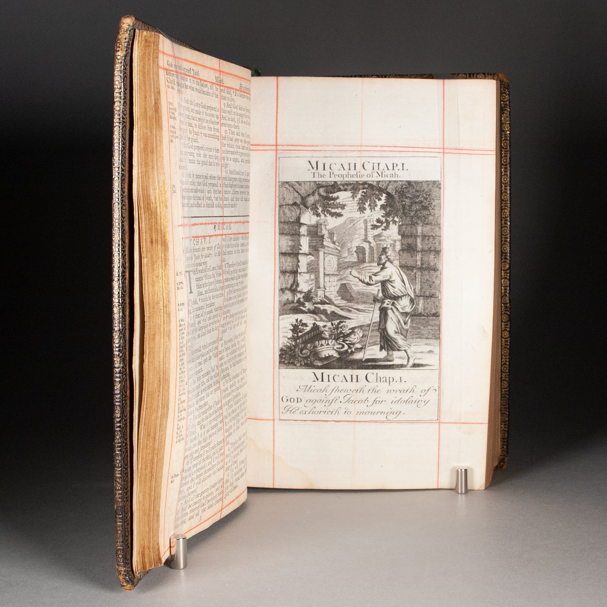
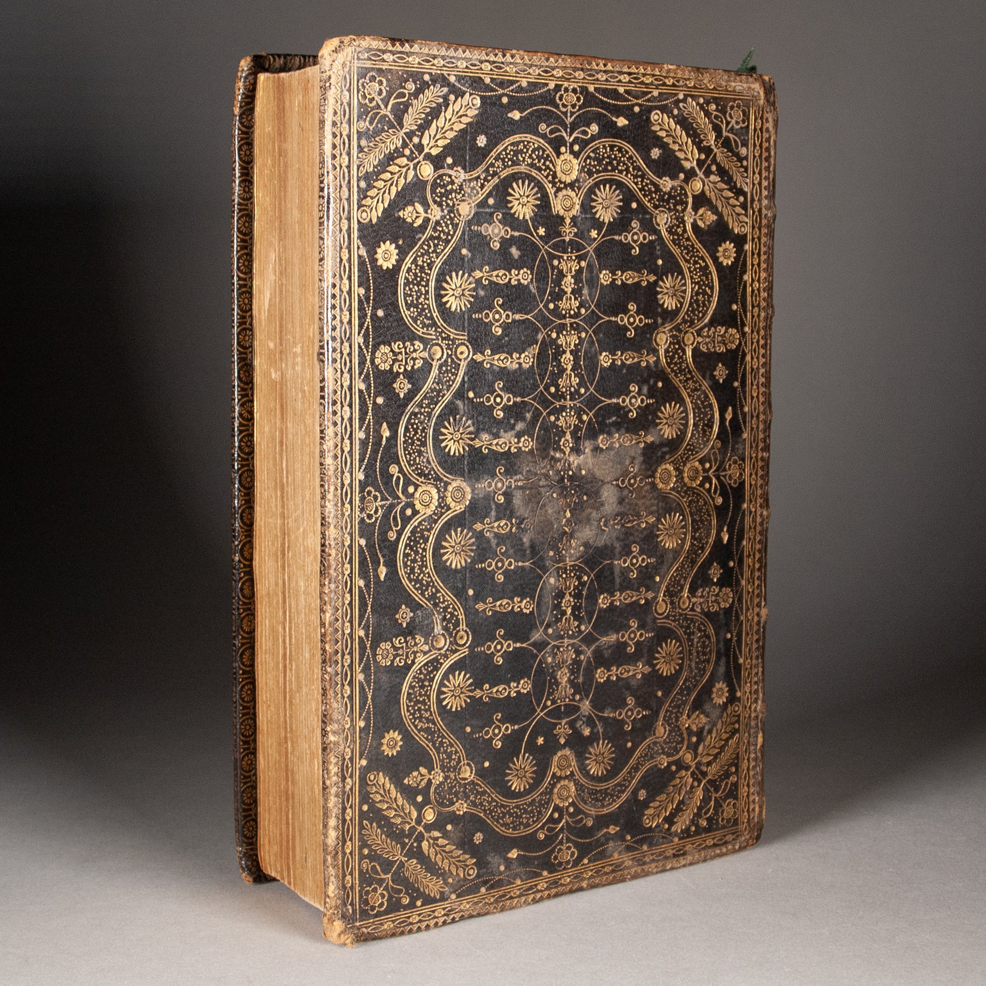
The second volume from one of Baskett's many Bible editions, paired with an Edinburgh edition of the Psalms, this copy thoroughly extra-illustrated with 141 finely engraved plates. These are very much influenced by, and some direct copies of, the plates John Sturt prepared for The Liturgy of the Church of England, issued perhaps as early as 1706. "This may be the ancestor (unless it too is derived from an earlier series) of countless similar sets of plates added to small eighteenth-century editions. They were copied and recopied." The broad strokes of composition certainly point to Sturt's as models for some of our plates, but they exhibit telling differences in detail. For example, looking closely at our St. John (second from the opening of his gospel), you'll find subtle differences in the rendering of the water and the layering of the clouds, to say nothing of Sturt's more decorative lettering. ¶ The practice of extra-illustration has a rich history dating to the earliest years of print, when it was perfectly common for owners to augment devotional manuscripts with a few woodcuts. Early printed books, too, sometimes served as repositories for illustrations gathered elsewhere. The Bible became an obvious platform for the practice, to the point that suites of prints were produced with extra-illustration specifically in mind. "Sixteenth- and seventeenth-century English printed Bibles were typically produced unillustrated,” for example, but “during the seventeenth century a trade developed in copies which were made pictorial by binding in sheets of Continental prints of biblical scenes. This evolved into a native trade in printing sets of engraved images, expressly produced for the purpose of binding them into Bibles and prayer books” (Pearson). ¶ The fashion kicked into high gear following the publication of Granger's Biographical History of England in 1769. Perhaps what distinguished the post-Granger from the pre-Granger approach was motivation. Earlier extra-illustration seemed rather more focused on supplying visual devotional aids, or visually informative representations of figures, scenes, and events described in a text. The goal was to augment meaning. It was the age of Granger when the practice surrendered to the voracious appetite of the print collector, when the augmentation of meaning takes a back seat to flexing the collector’s muscle, to augmenting the object. Our book appears to partake in that pre-Granger tradition, and could well have been done prior to his watershed publication of 1769. ¶ Here bound in the uniquely Scottish herringbone style, as emblematic an 18th-century Scottish style as the wheel binding. Herringbone bindings are defined by their central vertical axis, sometimes bisected with a short horizontal one, from which emanates a frequently botanical motif. What space remains is invariably further tooled in gold. Our central axis is dominated by interlocking circles and half circles, a motif not as common as botanical ones, though we find a few similar designs at the Bodleian, another at the V&A, and one at the British Library. The herringbone style has no obvious antecedent. M.J. Sommerlad has suggested it grew from a simple desire to fill the empty space inside the simpler rectangular panels that had long been in use. Undulating inner frames like ours were common, and turnip tools were perhaps the most popular. To be sure, attached to the stems of the flowers at our corners and midpoints of the edges, is a stylized turnip tool. The spine is fully decorated with floral and corner tools. Also typical of these Scottish bindings, our endpapers are a floral brocade paper, likely of Augsburg manufacture.
PROVENANCE: With an early gift inscription on a front fly-leaf: "Henrietta Hay, the gift of her dear uncle the Earl of Kinnoull, 1779." The earl would have been Thomas Hay (1710-1787), a reasonably accomplished politician who also traveled in some literary circles. Alexander Pope, for example, based a character on him in his Epistle to Dr. Arbuthnot. From 1765 to his final days—the period when he gifted this book to his niece—he was serving as Chancellor at the University of St. Andrews. Not bad provenance for a binding of such thoroughly Scottish character, from the chancellor of Scotland's oldest university.
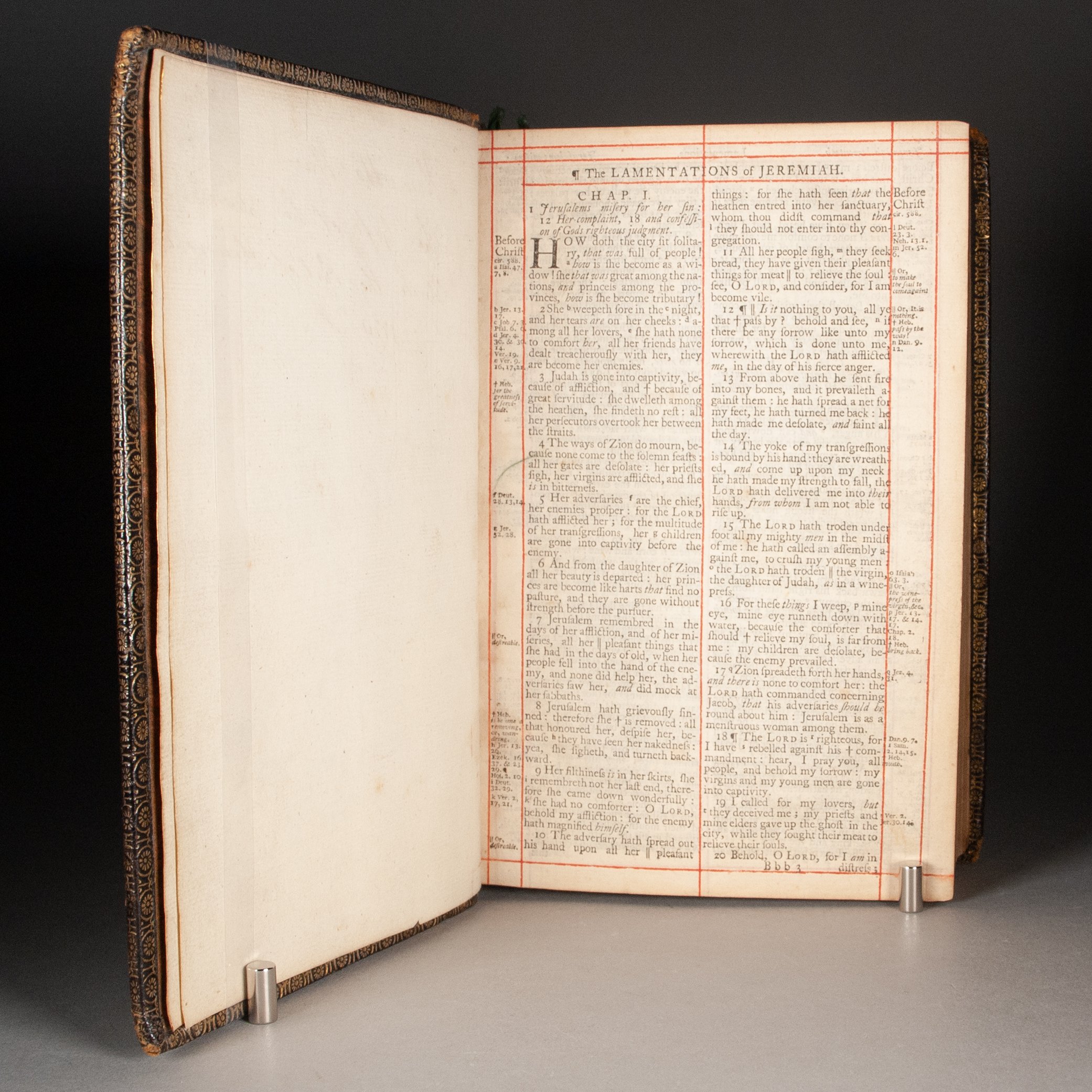
CONDITION: Bound in Scottish herringbone style as described above, sewn on a very sturdy six cords; orange and gold brocade endpapers, gilt edges, and remnants of silk ribbon markers. All pages hand-ruled in red (even the blank versos of the plates). Leaf L8 is blank. ¶ Mild dampstaining to the lower inner corner, affecting some text, but not touching the images; occasional foxing, and a few small ink stains on the fore-edge. The covers a little rubbed in spots, dulling some of the gold; extremities a bit rubbed, and the corners gently bumped, but really a model example of one of Scotland's most distinctive styles.
REFERENCES: On the content: Nicholas Barker, "The Book of Common Prayer," The Book Collector (Summer 2004), p. 177 (cited above); David Pearson, Speaking Volumes (Bodleian, 2022), p. 99 (cited above) ¶ On the binding: Jane Greenfield, ABC of Bookbinding (1998), p. 148 (on Scottish bindings: “This term applies to wheel and herringbone style bindings. These bindings usually had Dutch gilt embossed floral endpapers...Turnip and pear-shaped tools were popular.”); Etherington and Roberts, Bookbinding and the Conservation of Books: A Dictionary of Descriptive Terminology, “Scottish style,” accessed online (“A style of decoration developed by Scottish bookbinders of the 18th century. The designs, which are referred to as a ‘wheel’ and ‘herringbone,’ were well established by 1725 and continued in use until about 1775...”); M.J. Sommerlad, Scottish ‘Wheel’ and Herring-bone’ Bindings in the Bodleian Library (1967), #20-22 (herringbone bindings with central axes of interlocking circles), p. 1 (“In the eighteenth century Scottish binders developed two distinctive national styles. Both were established by 1725 and had entered their decline fifty years later. The designs are well-known and have come to be described as ‘wheel’ bindings and ‘herring-bone’ bindings...The origin of the herring-bone’...cannot be traced in so definite a manner, and it probably owes its existence to a desire to fill the rectangular centre-panels that had by then become a feature of so many designs.), 4 (“There does not seem to be any reason to suppose that the present bindings were executed anywhere other than at Edinburgh. The capital was probably capable of satisfying all the demand there was for ‘fine’ bindings of this type.”); John P. Harthan, Bookbindings (V&A Museum, 1961), #50 (another herringbone design with interlocking circles); Mirjam M. Foot, The Henry Davis Gift v. 2 (1983), #273 (another with interlocking circles); William H. Sherman, Used Books: Marking Readers in Renaissance England (2008), p. 91 (on simple red ruling: “This would have been executed by printers and binders as well as readers, and may have been an attempt to compensate for the relative disappearance of rubrication from English liturgical books")
Item #831