Varnished binding with early fore-edge painting
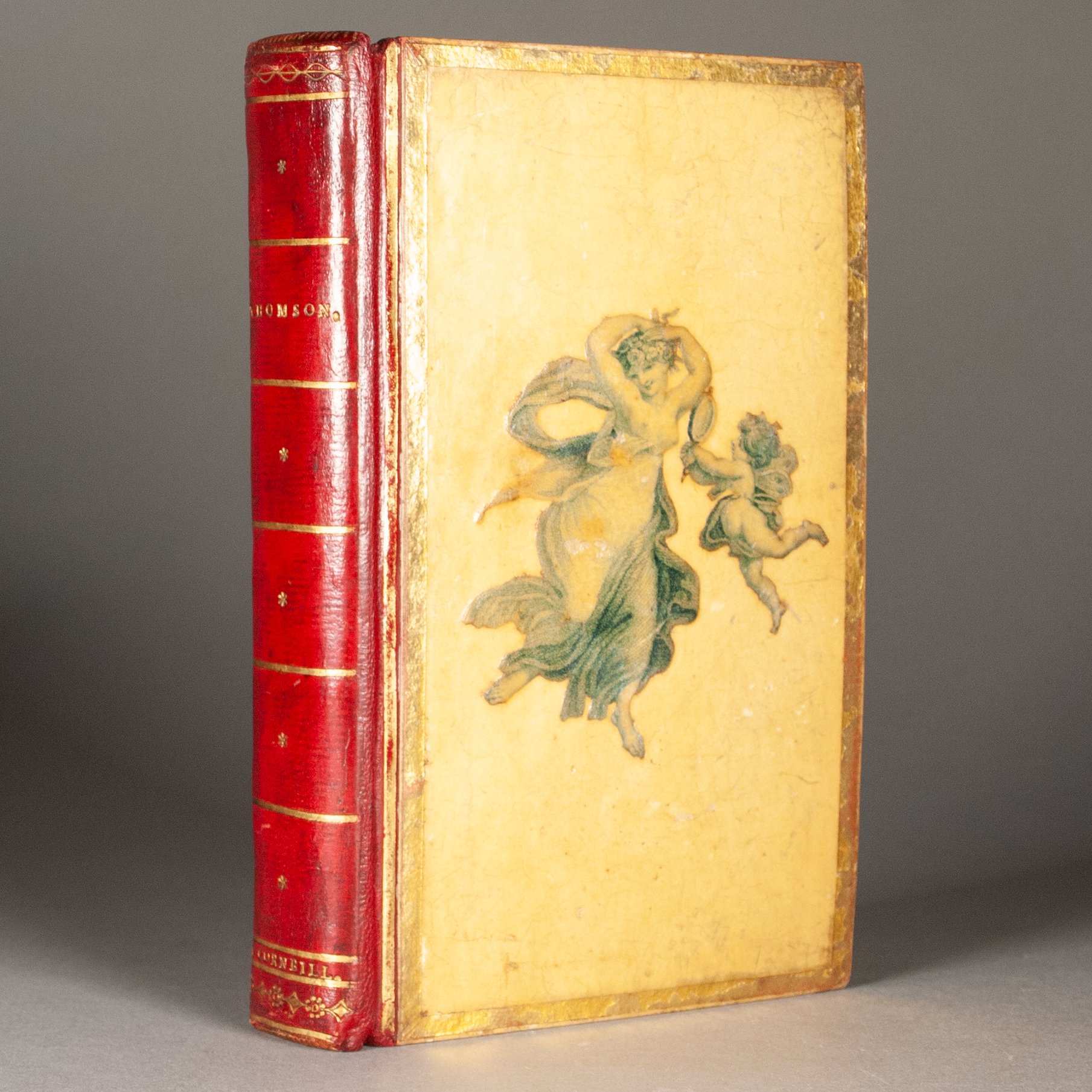


Varnished binding with early fore-edge painting
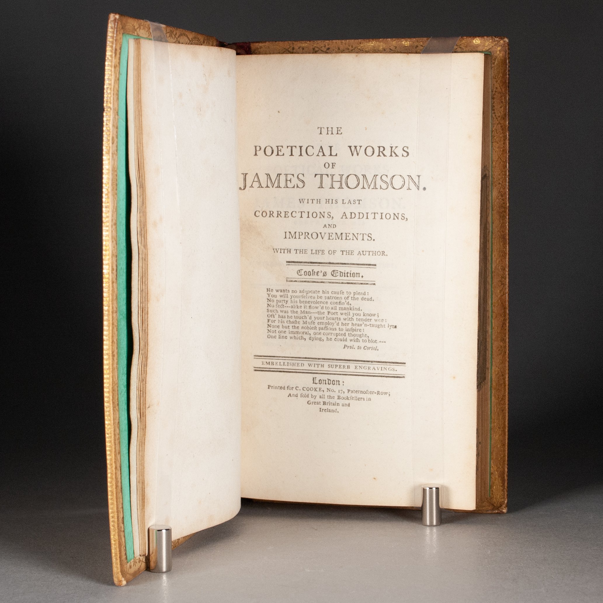
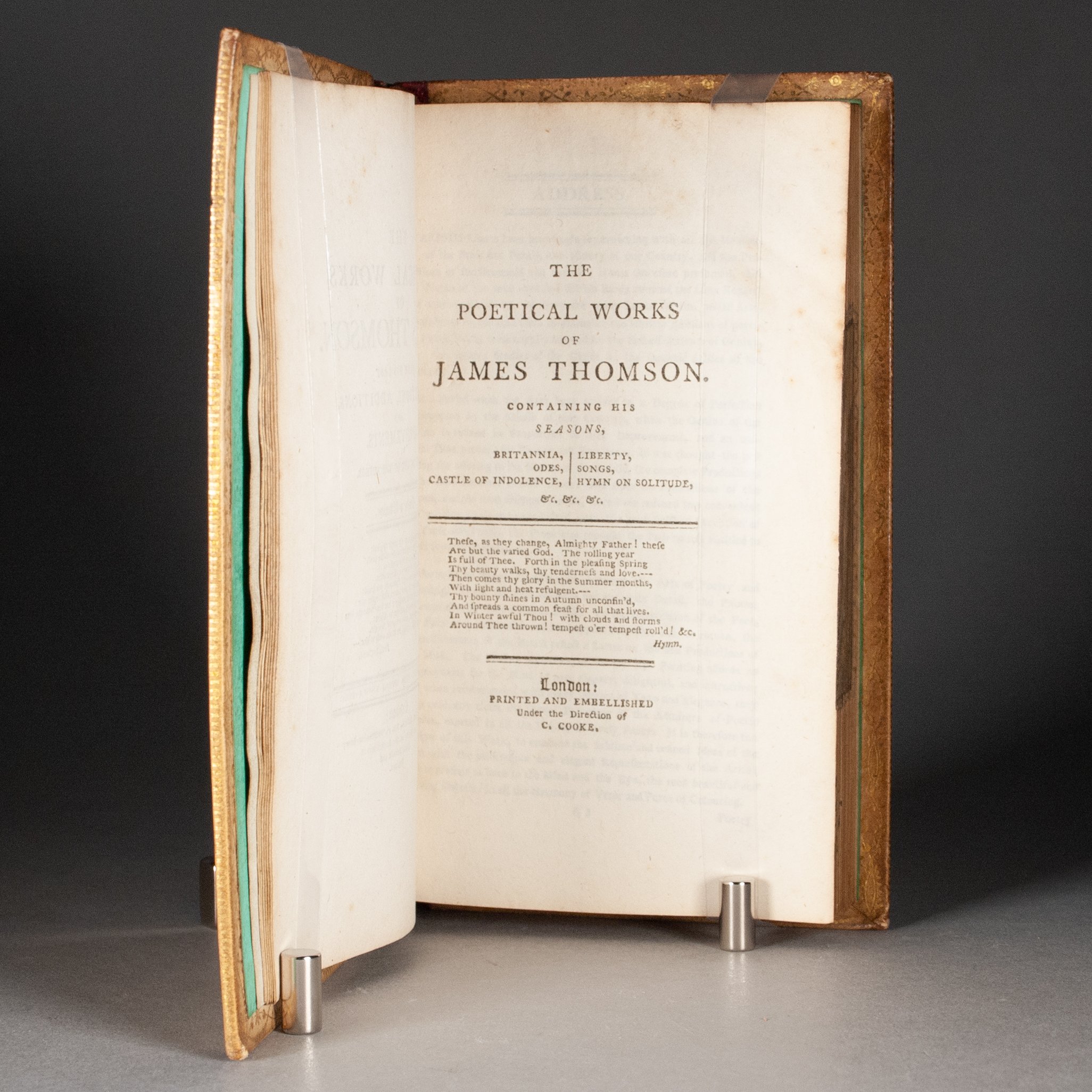
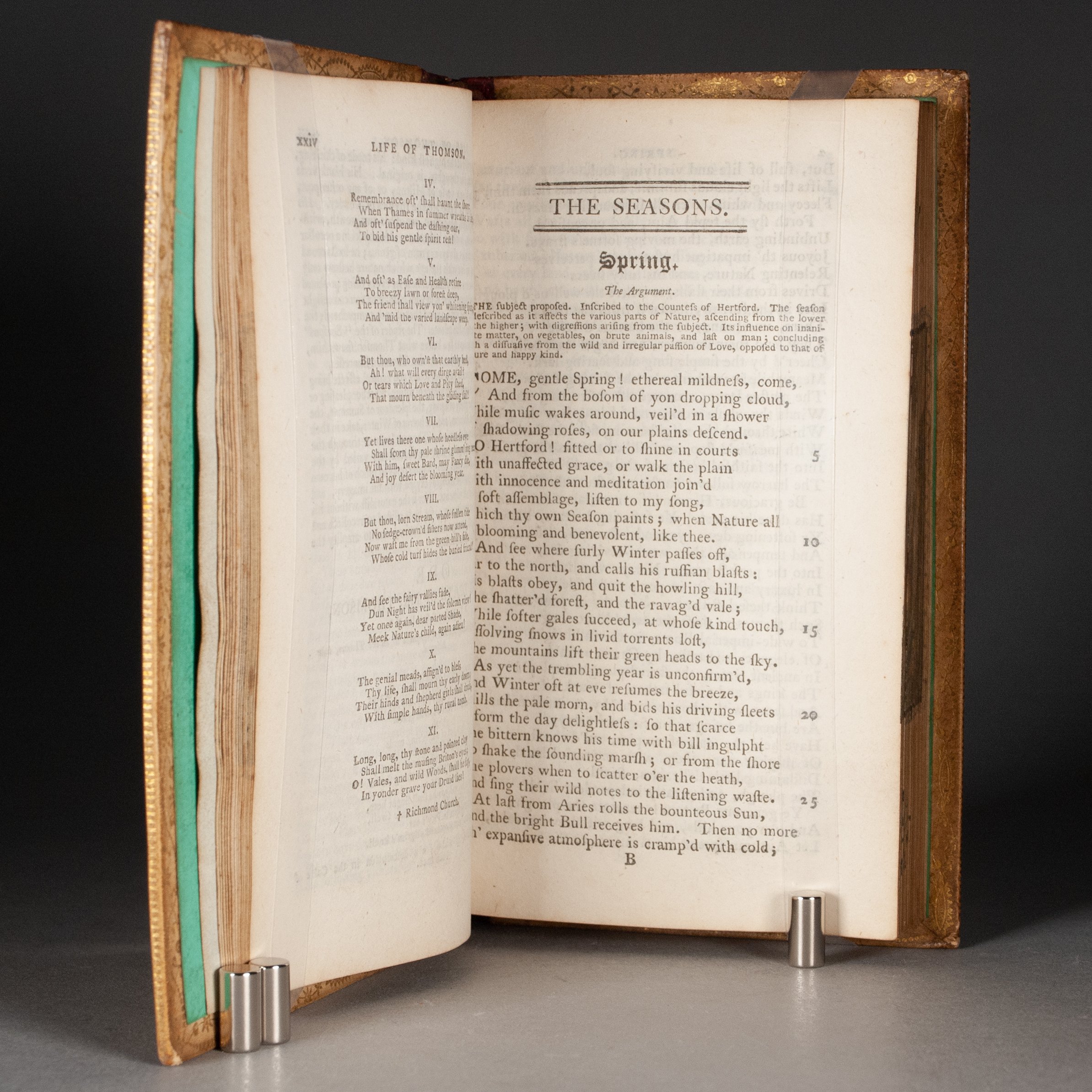
The poetical works of James Thomson, containing his Seasons, Britannia, Odes, Castle of Indolence, Liberty, Songs, Hymn on Solitude, &c. &c. &c.
by James Thomson
London: Charles Cooke, [1797?]
xxiv, 314, [2] p. + [7] plates | 12mo | A^6 a^6 B-2D^6 2E^2 | 153 x 91 mm
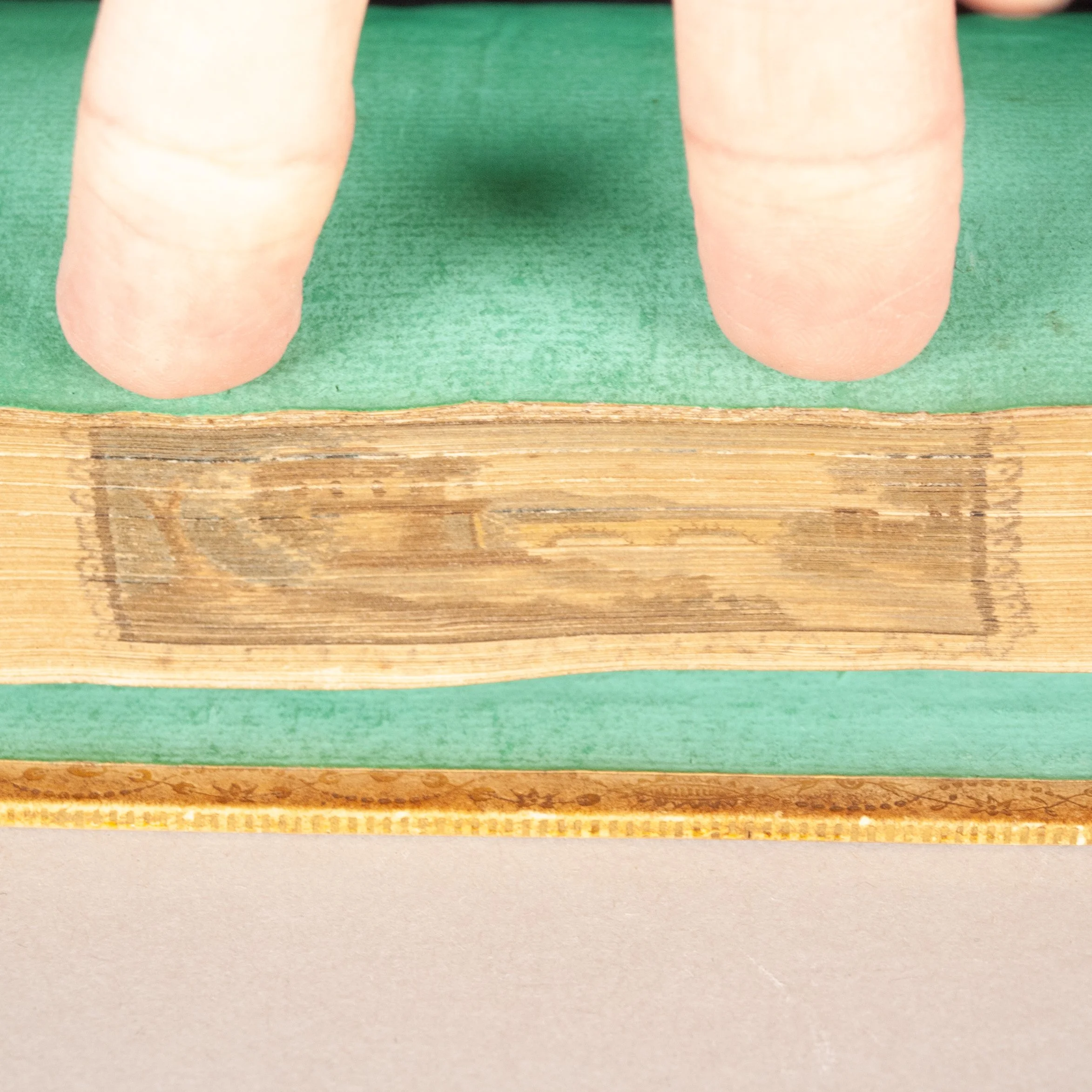
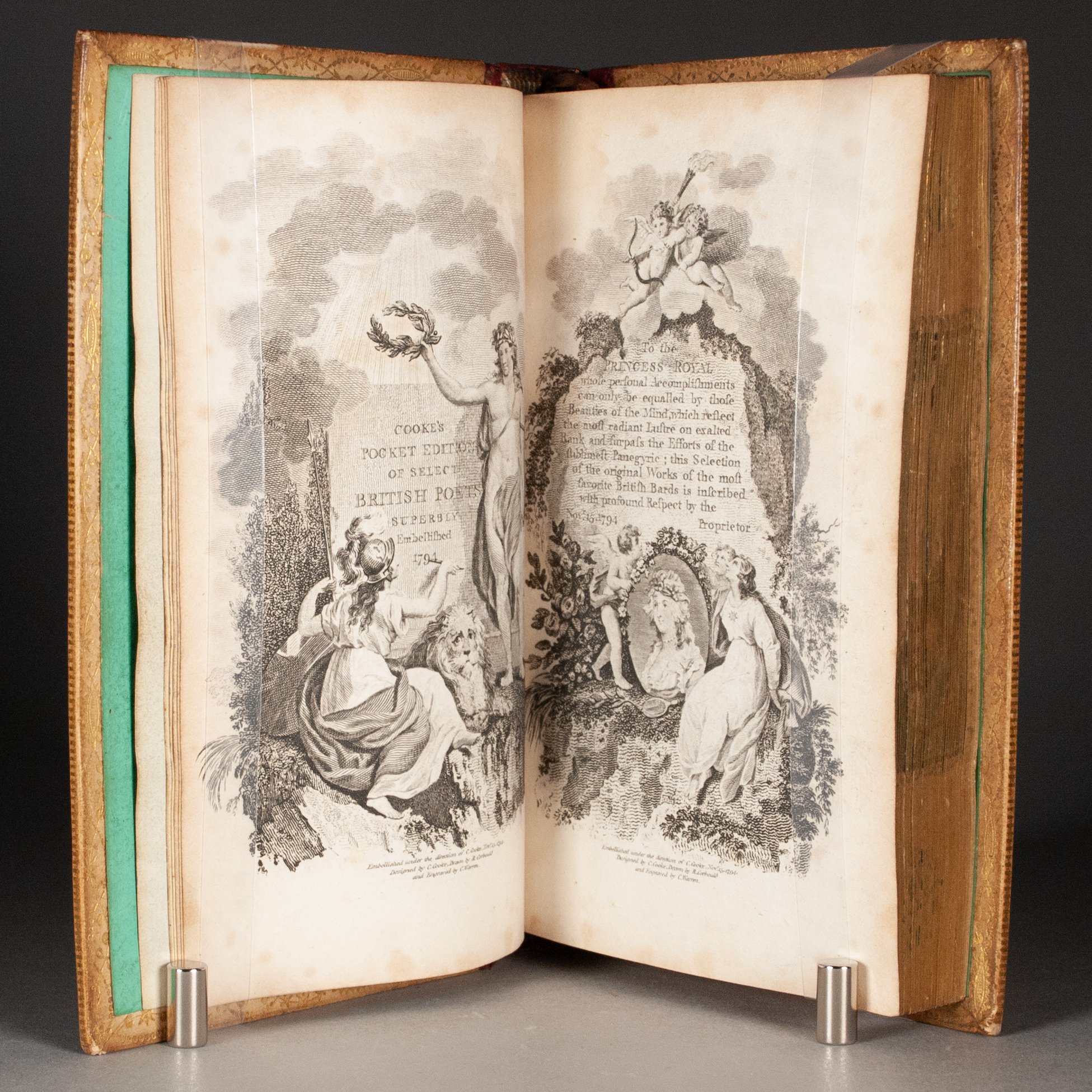
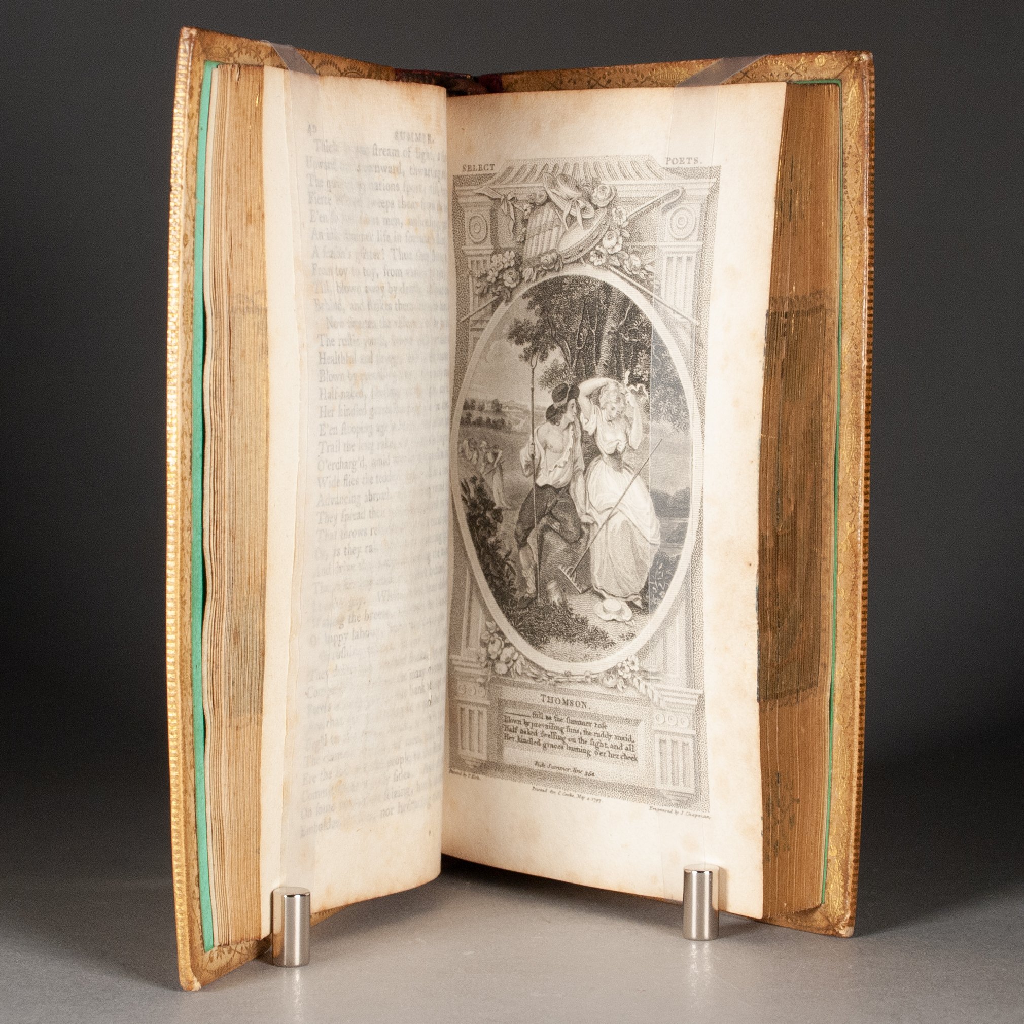
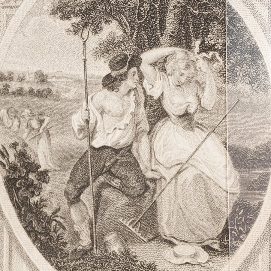
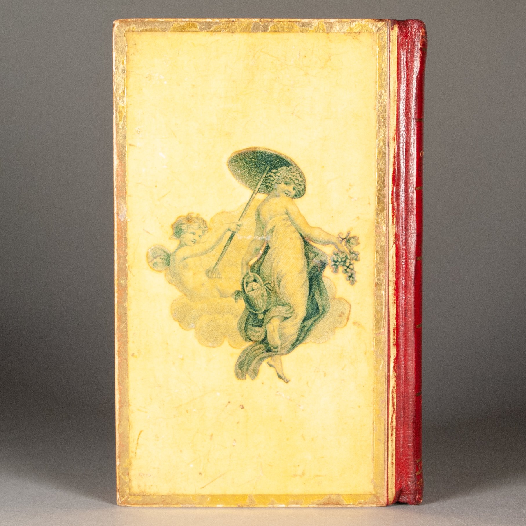
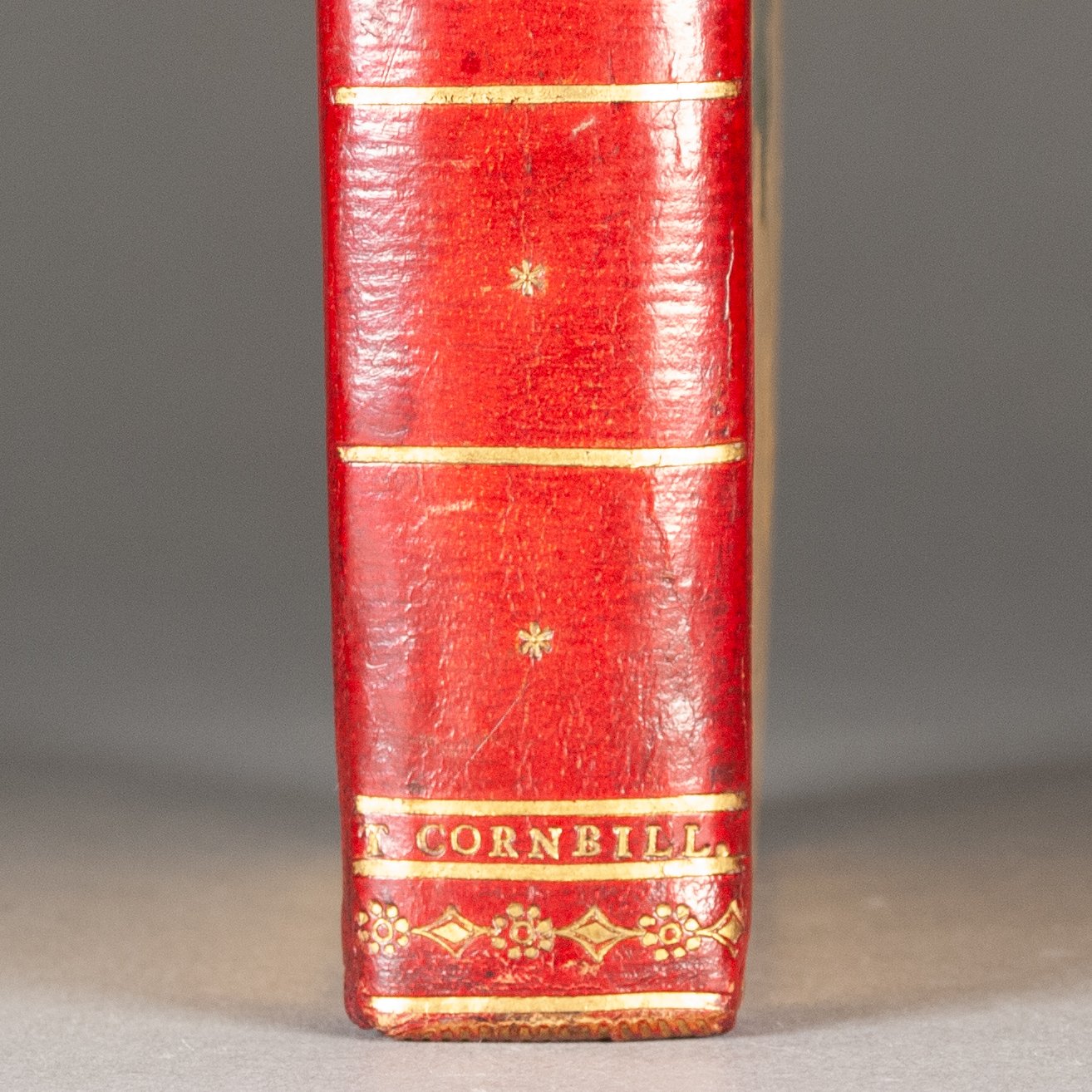
"Cooke's Edition" of the Scottish poet's tremendously popular musings on the four seasons, from Charles Cooke's Select British Poets series. Our engraved prelims are dated 1794, as seems standard, but we find various dates reported for the internal illustrations. Our plate facing p. 40 is dated 1797, for example. Further muddying the bibliographical waters, we've seen plate counts ranging from four to eight. We suspect Cooke was none too fussy on the matter, issuing copies as needed with whatever illustrations were available at the time. ¶ "Imagined as 'travelling companions,' Cooke's texts helped extend the possibilities of reading outside or in private. The competitive price and innovative layout established the pocket library as a cheaper alternative to both the high end of the market and [John] Bell's cheap editions" (Brewer). Thomson was a natural choice for the series, as popular then as he is forgotten today. First published in 1726 (though not completely until 1730), Thomson's Seasons went through countless editions, deep into the 19th century. His vivid descriptions of nature provided a ready supply for artists, and the work inevitably became a popular choice for illustrators and deluxe editions. ¶ And so perhaps unsurprisingly, Thomson was a wildly popular target for fore-edge paintings, too, and among the earliest. Carl Weber reports a 1779 fore-edge painting on Thomson, second among poets only to a 1776 Milton. Our fore-edge painting is strongly reminiscent of those produced during the golden age of the art, or what Carl Weber calls the Edwards Era. "In the entire three hundred years' history of fore-edge paintings," he writes, "there has been no era to equal the sixty-year period from 1774 to 1834." As in those from the studios of Edwards of Halifax and Taylor & Hessey, our painting exhibits the same fondness for old stone buildings in idyllic landscapes, and for rivers straddled by stone bridges. Compare our color scheme, and shading of the tree trunk, to an Edwards painting on an 1801 Letters of Lady Rachel Russell (Weber, p. 107), or to a pair of Taylor & Hessey paintings (Weber, p. 250). Our painting surely belongs to the same school, and is almost certainly contemporary with its binding. While the work of Edwards and Taylor & Hessey invariably occupies full fore-edges, our smaller painting uses only half the available surface. Flanking it are two floral branches, decorative additions more typical of fore-edge paintings a century older. It's an unusual blend of the landscape-dominant Edwards Era and the lighter floral motifs of the previous. ¶ The binding, too, is unusual, each board with a carefully trimmed engraving atop a cream paper, the covers then varnished. It calls to mind the rich vellucent bindings of Edwards of Halifax, but in a decidedly budget kind of way. Edwards painted scenes on the underside of transparent vellum. Our binder, one T. Cornbill, achieved a similar effect by adhering engravings to a vellum-toned paper. Even the thick gold borders evoke the thick gold-tooled ones on many Edwards vellum bindings. Cornbill was not alone in seeking a vellucent effect with engravings. In a much closer approximation of the Edwards technique, Maggs notes that Bartholomew Frye, too—who very likely worked for Edwards early in his career—sometimes applied engravings to the underside of transparent vellum (and otherwise occasionally adorned his covers with engravings). So perhaps it would be fairer to say our binding might more closely imitate an Edwards-derived style of Bartholomew Frye. We can find precious little about T. Cornbill, except that he was probably the same "T. Cornbill, bookbinder, late of Great Chapel-street, Westminster," reported as having died, aged just 24 years, in the 1 November 1801 issue of The Monthly Magazine. He is not listed in Charles Ramsden's London Book Binders 1780-1840. ¶ We should close with a word on varnished bindings, as it's possible Cornbill here consciously partook in a contemporary French trend, tapping an innovative technique to more affordably approximate the vellucent style. Commonly referred to as reliures vernis sans odeur, or vernis Martin, these bindings represent a French style in vogue during the final years of the 18th century and early years of the next. Decoration was typically painted on the covers and then varnished, leaving a protective high gloss. These were usually leather bindings, however, not paper-covered board, and they displayed a more striking contrast between the background and their decorative motifs—flowers painted on red leather, for example, or gold on a black ground. Cornbill here employed the same principle, but with a more sober result. ¶ A compelling, and perhaps unique, contribution to the golden age of fore-edge painting, from a forgotten London binder who came to a tragically young end.
PROVENANCE: A penciled note by his son on a front fly-leaf indicating the book belonged to Benjamin John Warren (d. 1892), who spent his younger days in London.
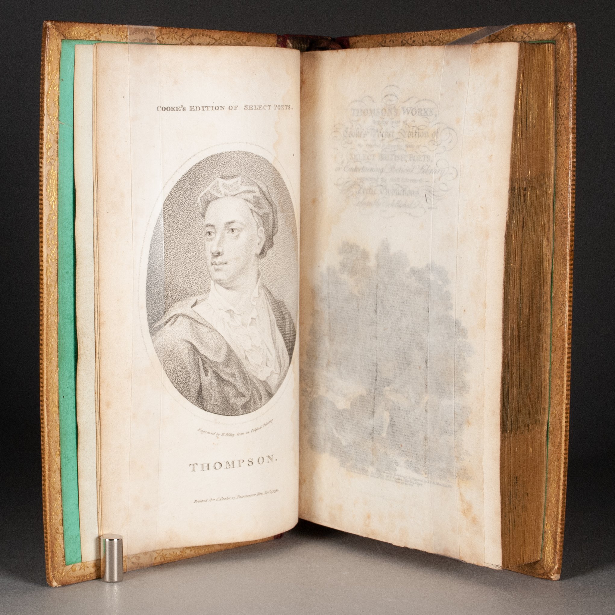
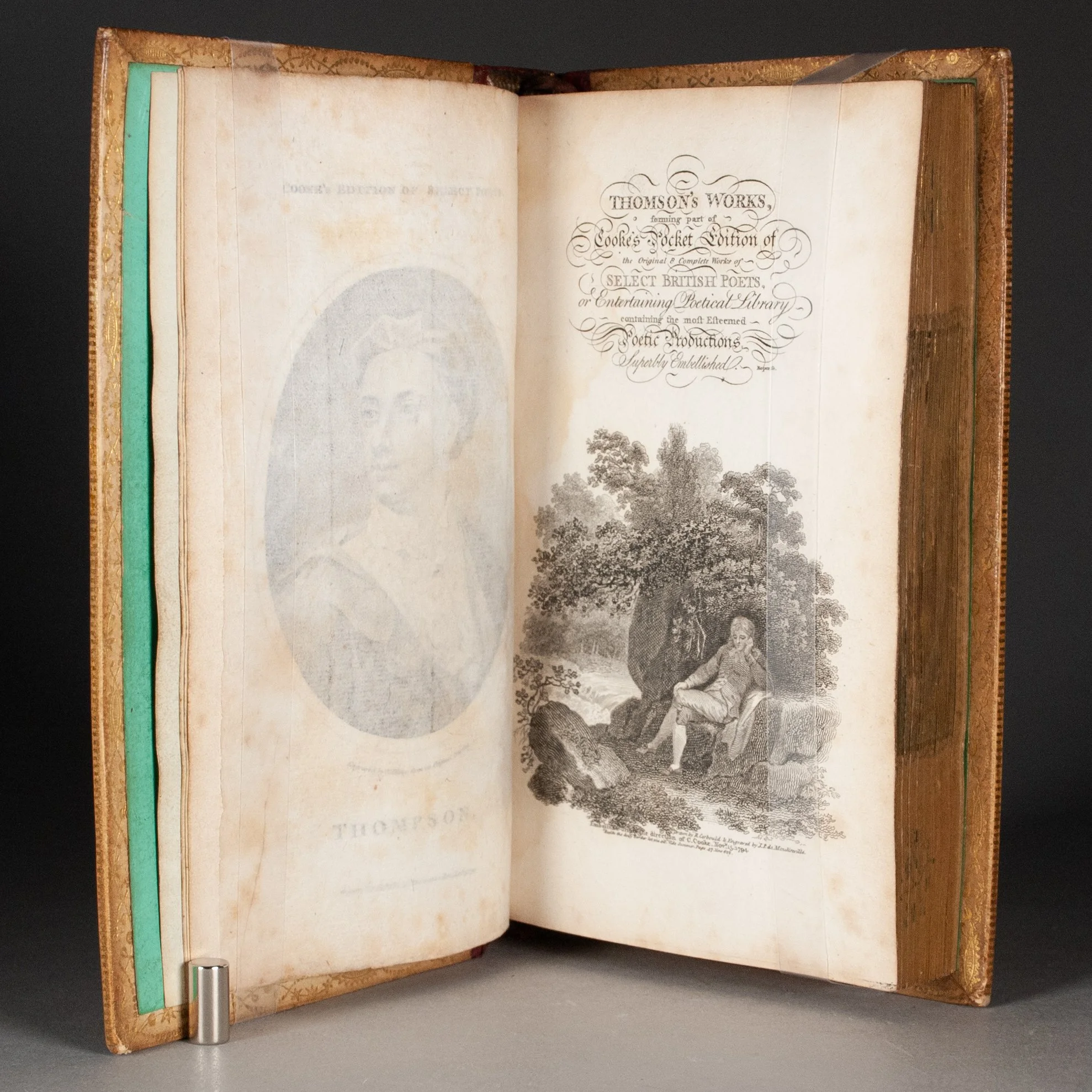
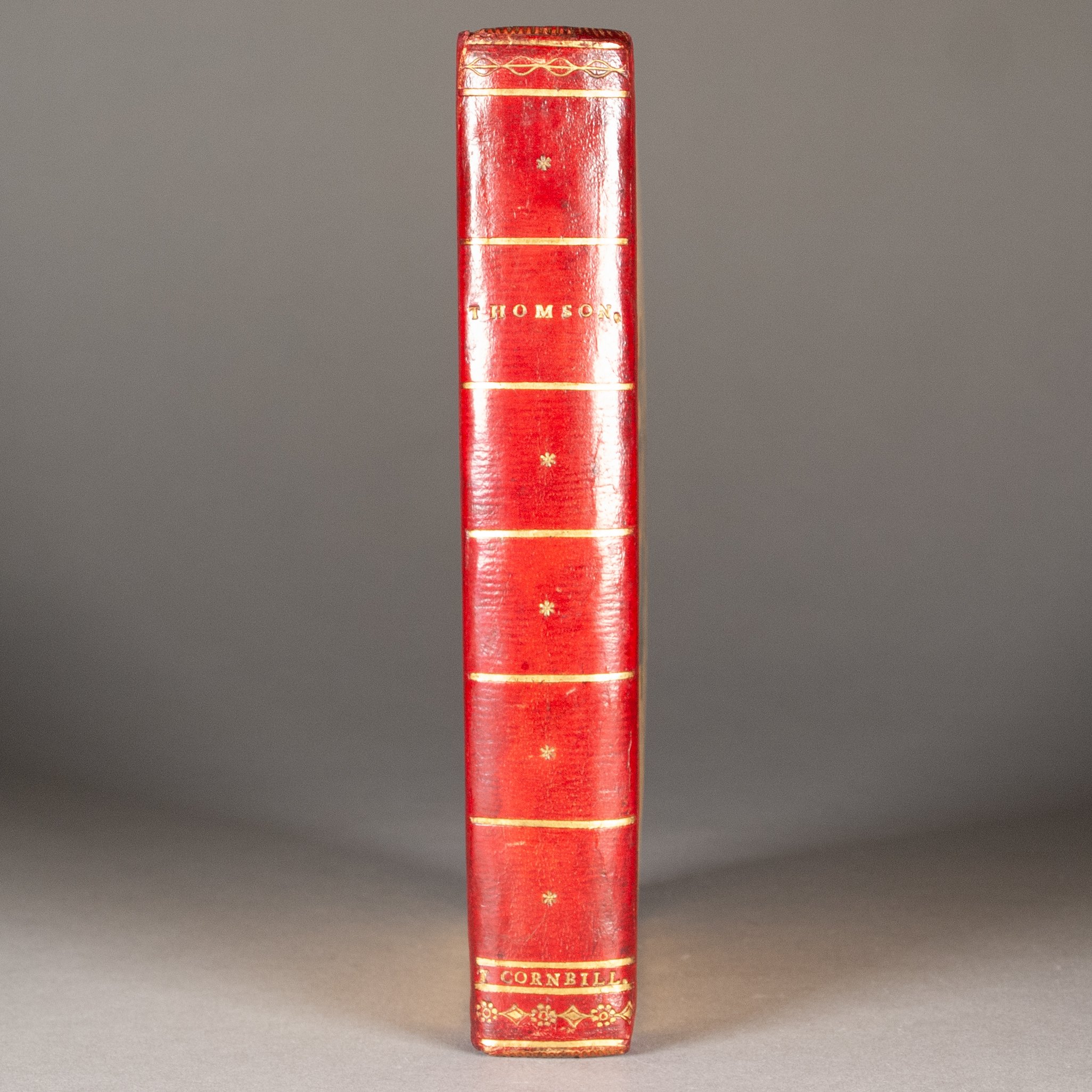
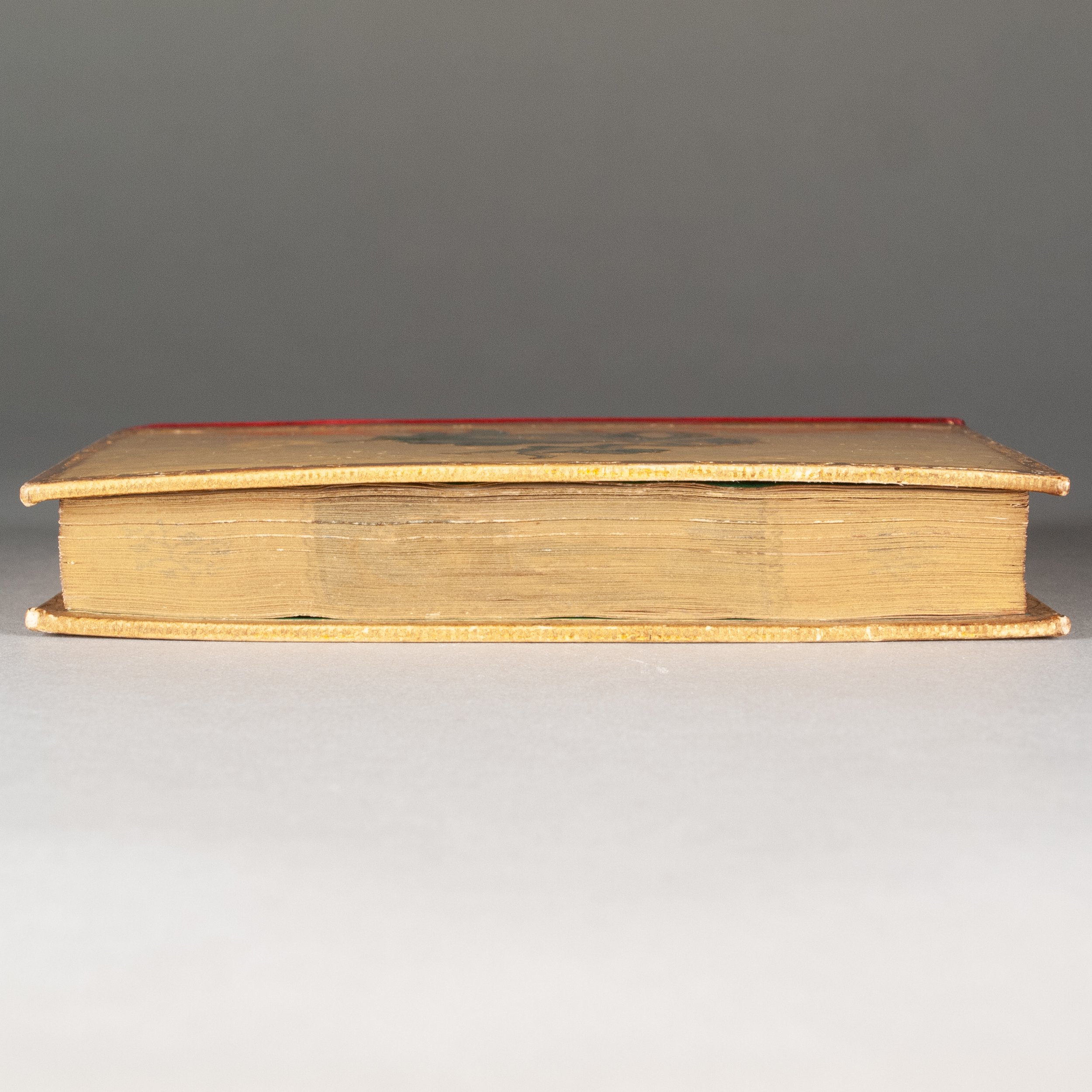
CONDITION: Contemporary varnished boards, described above, with a straight-grain red leather spine simply tooled in gold, signed "T. Cornbill" at the foot of the spine; board edges and turn-ins rolled in gold; painted green endpapers; silk ribbon marker; edges gilt, concealing a fore-edge painting as described above. The painting itself is handsome work, but the edge gilding fails to fully hide it. The fly-leaves are watermarked 1794, and the plates have four remarkable tissue guards made from shockingly thin handmade laid paper. With a second letterpress title (The Poetical Works of James Thomson, with lis last corrections, additions, and improvements), plus an added engraved title (Thomson's Works, forming part of Cooke's pocket edition of the original & complete works of select British poets). The seven plates include a frontispiece portrait of the author, the engraved title, Cooke's engraved series title, his engraved dedication, and illustrations facing p. 40, 84, and 121; those facing p. 40 and 121 were designed by Thomas Kirk. ¶ Some light foxing, but really quite nice internally. Hinges reinforced with a dark blue silk, the silk just splitting (but hinges remain very solid); varnish inevitably yellowed and a bit crazed; gilt borders a bit rubbed. A very attractive little book.
REFERENCES: On the text: David A. Brewer, "The Interregnum and the Long Eighteenth Century," The Book in Britain (2019), p. 234 (cited above); Sandro Jung, James Thomson's The Seasons, Print Culture, and Visual Interpretation, 1730-1842 (2015), p. 2 ("a literary text that, within a decade of its first edition, had attained the status of cultural capital") ¶ On the fore-edge painting: Carl J. Weber, Fore-Edge Painting (1966), p. 45 (cited above), 57 ("All the specimens of fore-edge painting which have survived from the century 1650-1750 make use of such floral designs, scrolls, and arms—plus, in a few cases, portraits in small medallions, enclosed in or accompanied by floral designs"), 182 (poets "unquestionably represent the most important category" of fore-edge paintings), 183 (for Thomson's popularity among fore-edge paintings); Jeff Weber, Annotated Dictionary of Fore-Edge Painting Artists & Binders (2010), p. 9 ("floral and natural motifs, are quite typical of the late seventeenth-century"), 13 (quoting Bill Fletcher on late 18c and early 19c fore-edge paintings: "few of them will be town or city scenes, and most of them will be of country houses, country scenes with house or church in background"; Weber adds: "views of English country houses, etc., are indeed frequently reliable early specimens of fore-edge paintings on bindings contemporary with the imprints."), 19 ("many fore-edge paintings eventually require repair, as the act of fanning the leaves stresses the binding hinges"), 32 ("The English bucolic landscape view started toward the end of the eighteenth century and was established by Edwards of Halifax as a standard form of book decoration"); Howard Nixon and Mirjam Foot, The History of Decorated Bookbinding in England (1992), p. 90 ("the painting of designs under the gold on the fore-edge of books dates back in England to the 1650s. It was quite common during the Restoration period, and was continued in the first half of the eighteenth century by John Brindley.") ¶ On the binding: Maggs Bros., Bookbinding in the British Isles (1996), pt. 2, #213 ( a leather binding with inset engravings, and commenting on the use of engravings by Frye of Halifax); The Monthly Magazine 12.4 (1 Nov 1801), p. 372 (for Cornbill's death notice); Albert Ehrman, "Les Reliures Vernis sans Odeur," The Book Collector (Winter 1965), p. 523-527 (finding such varnished bindings made in France 1791-1818); Léon Gruel, "Reliures en vernis sans odeur," Bulletin du bibliophile (1900), p. 187-194 (describing a few varnished bindings in detail)
Item #829